Easy Own, 2023
Redefining Home Furnishing: A User-Centric Design for the Modern Lifestyle

My Role
User Research
Conceptualization
Design
Usability Testing
Prototyping
Tools
Figma
Gemini
Zoom
Whimsical
Google Survey
Duration
2 months
Screens
20 screens
introduction
My Design Journey: From Moving Chaos to a Smoother Solution
Ever wrestled with overflowing boxes and the hunt for furniture that won't break the bank (or your back during the next move)? That was my recent reality, a common struggle for us mobile 20-29 year olds (RubyHome). This firsthand frustration, the stark contrast between our fluid lives and the rigid, slow, and expensive world of traditional furniture, ignited a mission: to design a smarter, more adaptable way to create a home, no matter how often "home" changes.
PROBLEM BREAKDOWN
Key Challenges: Uncovered Through User Interviews
To gain a deeper understanding of the challenges faced by young adults relocating and setting up new homes, I conducted eight user interviews with individuals aged 20-30 who had recently moved. The recurring themes and pain points that emerged from these conversations strongly resonated with my own initial experiences, solidifying the significance of these issues within this demographic. The key findings from these interviews highlighted:
“Budgeting Blues”
Limited financial resources can pose challenges and frustrations in acquiring essential furniture and home decor items.
"Decision Overload"
The abundance of choices in the market for furniture and home decor can lead to decision fatigue, making it challenging to finalize purchases.
“Coordination Chaos”
Juggling work, social life, and setting up a new home can be overwhelming. Finding time for moving logistics, shopping, and unpacking is a challenge.
Meet Our User
Sarah: The New Kid in Town
Sarah, a recent college grad, is eager to start her new life in a bustling city like San Francisco. With limited funds, she's faced with the daunting task of creating a stylish and functional home. Navigating countless furniture options and determining essential items can be overwhelming, especially for someone starting from scratch.

Click Here, to view the Figma file
STORY BOARD
Visualizing the Journey: Sarah's Story and Why it Mattered
To truly grasp the emotional side of setting up a new home in a new city, I used a storyboard to visualize the journey of Sarah, a user whose experience mirrored my own and the challenges from user interviews.

Why a storyboard? It wasn't about just showing steps, but about building empathy. Seeing Sarah's initial overwhelm, her budget frustrations, and feeling lost brought the research to life, making the "Budgeting Blues" and "Coordination Chaos" feel real.
What did I learn? The storyboard reinforced the emotional stress of moving and being without a comfortable home. It also highlighted the importance of easy discovery of solutions and powerfully showed the positive impact a flexible, affordable furniture option could have on Sarah's sense of stability and focus.
Affinity mapping
Brainstorming Ideas
After brainstorming various solutions to the challenges faced by individuals moving into new homes, two key areas of focus were identified: flexibility and simplicity.

Flexible Payment Options: Provide a rent-to-own furniture platform which allows the users to rent or purchase goods and provide easy returns of rental.
Simplified Design: Create style guide for users to choose from where each style guide will have furniture listings to purchase/rent.
problem statement
Narrowing down the problem area
“How might we provide convenient and flexible options for buying furniture for Ria's changing life situations?”
Rough Drafts, Big Ideas
Mid-Fidelity Wireframes
Low-fidelity sketches were the first step towards visualizing the user's journey, through key features like the shopping list, flexible pricing model, and product comparisons. This iterative process helped me quickly explore different ideas and refine the user flow, ensuring a seamless and intuitive experience.
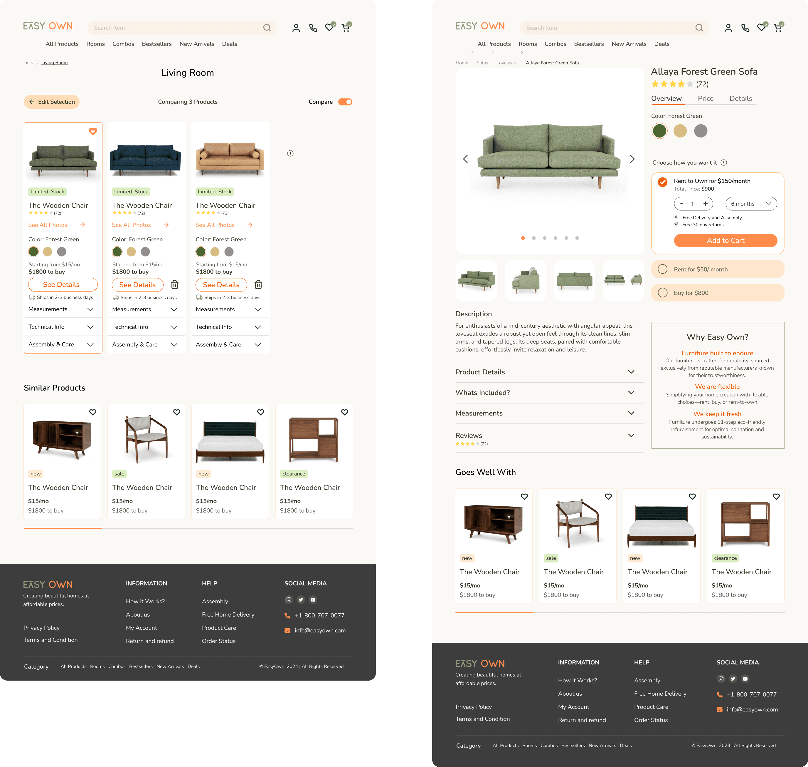
Product Detail Page
The product detail page is a critical point where Sarah moves from browsing to considering an item. My design focused on providing the necessary information and flexible options for a confident and convenient decision, directly addressing the challenge of adaptable buying solutions.

Prominent "Choose how you want it" section immediately presents flexible acquisition options (Rent, Rent-to-Own, Buy) catering to various needs.
Clear monthly and total pricing for each option ensures transparent financial decisions aligned with Sarah's budget.
Organized product details via accordions provide accessible information for informed evaluation.
A clear "Add to Cart" button offers a direct and intuitive path to purchase for any chosen option.
Product Compare Feature
This wireframe illustrates the "Living Room" category page, designed to help Sarah conveniently explore and select furniture. The prominent "Sort By" and "Compare" features directly address the need for flexible options by allowing Sarah to organize products based on her priorities (price, popularity, etc.) and directly compare items side-by-side.

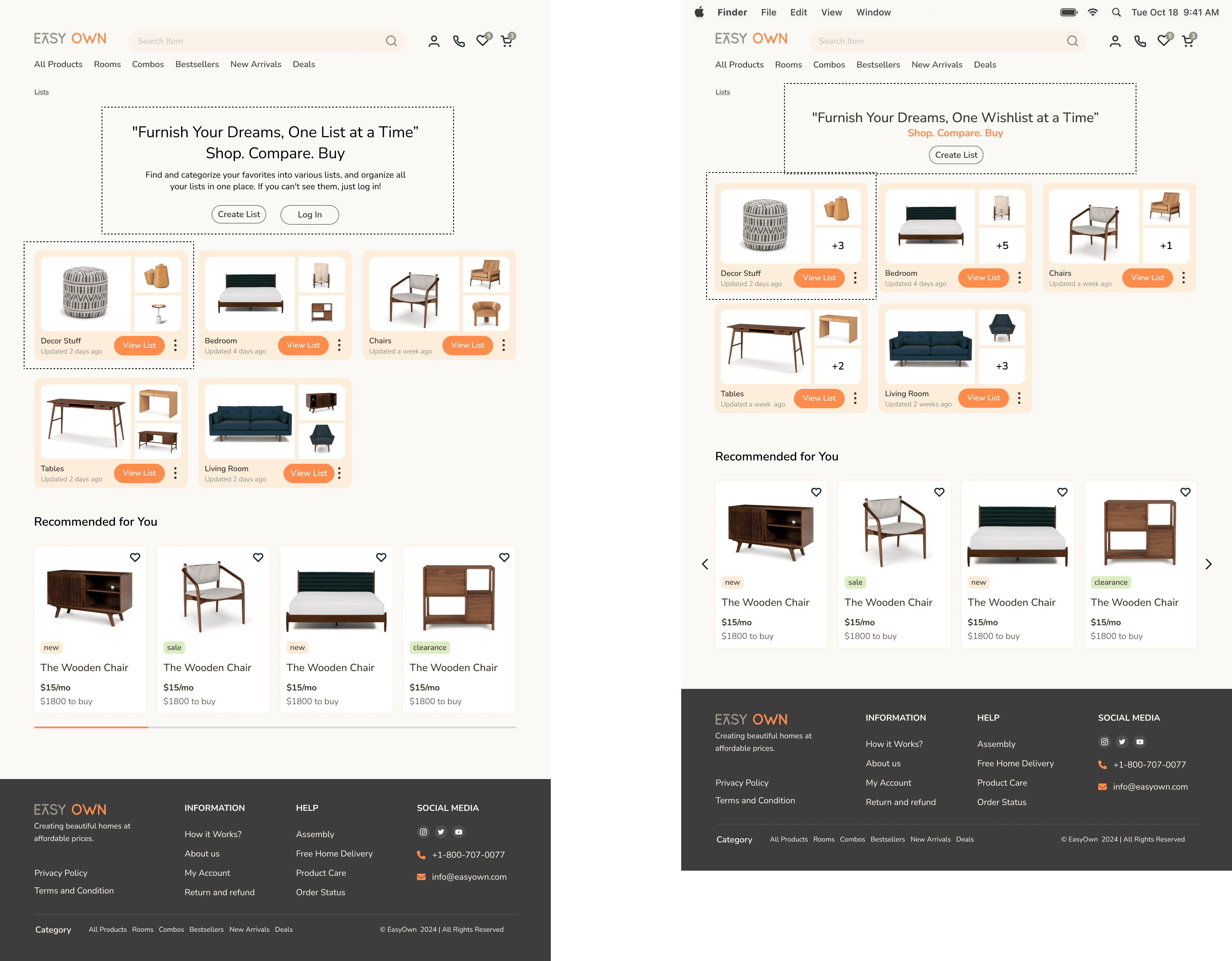
Shopping Lists
This wireframe introduces the "Shopping Lists" hub, designed as Sarah's central command for furnishing her home conveniently and flexibly. The tagline "Furnish Your Dreams, One List at a Time" encapsulates its purpose: a space to organize aspirations.

Convenient Organization: All saved furniture ideas live here, easily accessible for review and planning.
Flexible Planning: Sarah can create lists for different rooms or future moves, adapting her choices to evolving needs.
Streamlined Access: Quick "Explore" buttons allow instant access to curated selections.
Foundation for Action: The hub integrates shopping, comparison, and buying, streamlining the entire furniture journey.
Bringing it to life
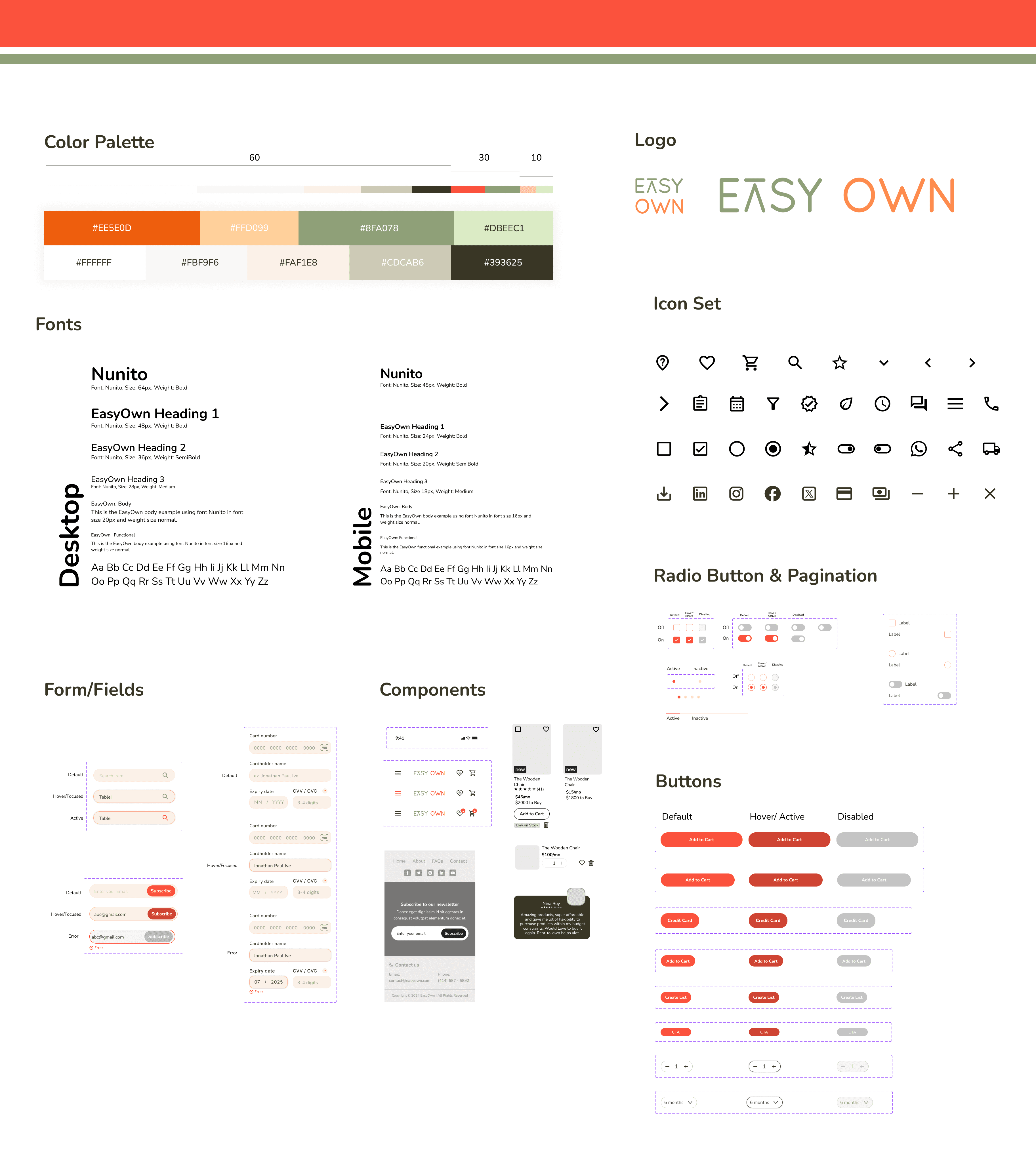
Style Guide
To create a consistent and user-friendly experience, I developed a style guide that embodies affordability, approachability, transparency, and thoughtfulness. This guide ensures that every design element aligns with our brand and user needs.
adding finishing touches
High- Fidelity Wireframes
Leveraging insights from user interviews, I crafted high-fidelity wireframes tailored for desktop screens. While mobile browsing is common, the critical decision-making and purchasing often happen on larger screens. By prioritizing the desktop experience, we ensure a seamless and optimized user journey.
A Real-World Reality Check
Usability Testing
To ensure the design was user-friendly, moderated usability test was conducted with 5 participants. The goal was to see how easy it was to manage shopping lists, compare products, and complete the checkout process. By observing user behavior, areas for improvement were identified and the design was refined to create a seamless and enjoyable experience. The testing insights are listed below:

Insights
Some users struggled to find the shopping list, often mistaking it for the cart. To address this, clearer labels and visual cues were added.
Information on monthly installments was found to be unclear. To improve this, more detailed explanations and examples were provided.
The product comparison process was perceived as lengthy and complex. To simplify this, the number of clicks was reduced and the process was streamlined.
Users expressed a desire to share products with friends and family. A social sharing feature will be explored in future updates.
Fine-Tuning the Design
Design Revisions
Based on the testing insights, design revisions were made to make the design interface more intuitive and user friendly.
Priority Revision 1

Initially, users found it difficult to purchase items directly from the wishlist. To simplify this process, a direct "Add to Cart" button was added and used chevrons to quickly view product details.
The "Manage" button distracted users during product comparisons. To improve the user experience, this button was removed in those specific contexts.
After
Before
Priority Revision 2
The initial design assumed users were new to lists. However, users were already familiar with creating and managing multiple lists.
To simplify the design, unnecessary elements were removed and a familiar heart icon was used for the wishlist. Additionally, the item number was displayed directly on the list thumbnails.
After
Before
Priority Revision 3
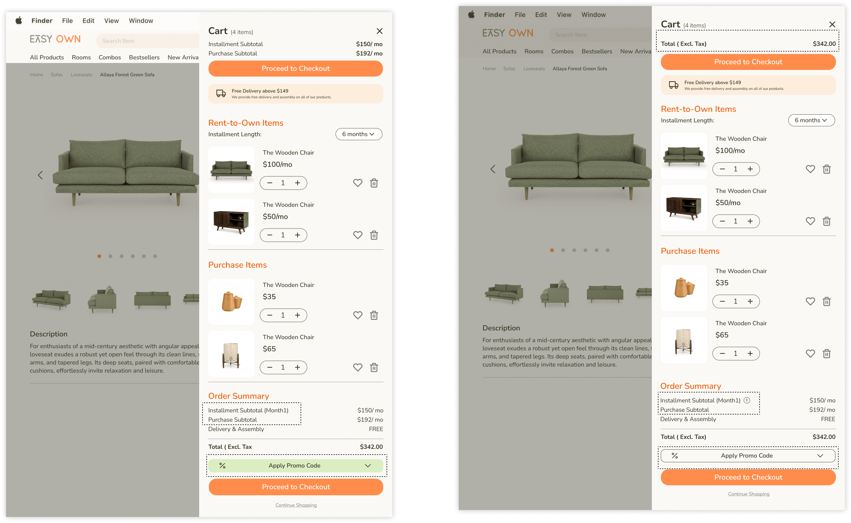
To provide more clarity, an icon link was added next to the Installment subtotal to provide additional information. The "Apply Coupon" button was toned down to avoid distracting users from the primary action of proceeding to checkout.
Additionally, the summarized pricing at the top was simplified to focus on the total cart amount.
Before
After
closing notes
Conclusion
By focusing on flexibility, affordability, and a seamless user experience, a user friendly solution was developed that empowers individuals like Ria to adapt to life's changing circumstances. The overall approach addresses budget constraints, simplifies the selection process, and fosters a sense of autonomy, making the process of furnishing a home both efficient and enjoyable.