iOverlnader, 2024
Redesigning iOverlander: A Responsive, User-Centric Approach
iOverlnader, 2024
Redesigning iOverlander: A Responsive, User-Centric Approach
iOverlnader, 2024
Redesigning iOverlander: A Responsive, User-Centric Approach
My Role
User Research
Conceptualization
Design
Usability Testing
Prototyping
Tools
Figma
Gemini
Zoom
Whimsical
Google Survey
Duration
2 months
Screens
20 screens
background
background
The Great Outdoors, The Not-So-Great Online Experience
Lost in the Crowd: The Networking Dilemma
Overlanding, a thrilling blend of adventure travel and self-sufficient camping will grow by 6.11% (CAGR 2024-2029) as per Statista. As more and more people seek out immersive outdoor experiences, the demand for reliable and user-friendly platforms to plan and book overland trips has grown significantly. IOverlander, a popular platform for campers, offers a wealth of information and community features. However, its current user interface and booking process present several usability challenges that hinder the overall user experience.
Smaller, intimate events like industry meetups or workshops can still present challenges for attendees looking to build meaningful connections. Traditional networking methods, while effective in smaller settings, may not always facilitate efficient and personalized interactions.
Problem statement
User Pain Points on iOverlander
iOverlander users, particularly those new to overlanding, often encounter difficulties in navigating the platform, finding suitable campsites, and completing the booking process. Key pain points include:
Cluttered and confusing interface: The current design lacks clarity and organization, making it hard for users to find the information they need.
Inconsistent information: Data on campsites, amenities, and regulations can be incomplete or outdated, leading to uncertainty and frustration.
Complex booking process: The booking process is cumbersome and time-consuming, often requiring multiple steps and manual data entry.
Limited mobile optimization: The platform's mobile experience is subpar, making it difficult for users to plan and book trips on the go.
decoding the camper’s mind
background
A User Research Deep Dive
Lost in the Crowd: The Networking Dilemma
To gain a deeper understanding of the challenges and desires of campers, we conducted in-depth interviews with six individuals aged 24-35. These participants were experienced campers who have explored various camping styles and locations. Our goal was to identify:
Smaller, intimate events like industry meetups or workshops can still present challenges for attendees looking to build meaningful connections. Traditional networking methods, while effective in smaller settings, may not always facilitate efficient and personalized interactions.
Preferred search methods
Trip planning timelines
Booking criteria
Pain points and frustrations
Evaluation of existing platforms
Key Findings
Information Overload: Users struggle to find accurate and up-to-date information about campsites across various platforms.
Lack of Personalization: Inability to find campsites tailored to specific needs and preferences.
Limited Flexibility: Difficulty in finding last-minute campsites or making spontaneous trip plans.
Cluttered Interfaces: Complex booking processes and poorly designed websites hinder the user experience.
User persona
background
Thomas, the Spontaneous Adventurer
Lost in the Crowd: The Networking Dilemma
Thomas is a young, tech-savvy individual who loves to explore the outdoors. He's always up for a spontaneous adventure, often making impulsive decisions about where to go and what to do. While he enjoys the freedom of overlanding, he often finds himself overwhelmed by the sheer number of options and the complexity of planning a trip.
Smaller, intimate events like industry meetups or workshops can still present challenges for attendees looking to build meaningful connections. Traditional networking methods, while effective in smaller settings, may not always facilitate efficient and personalized interactions.
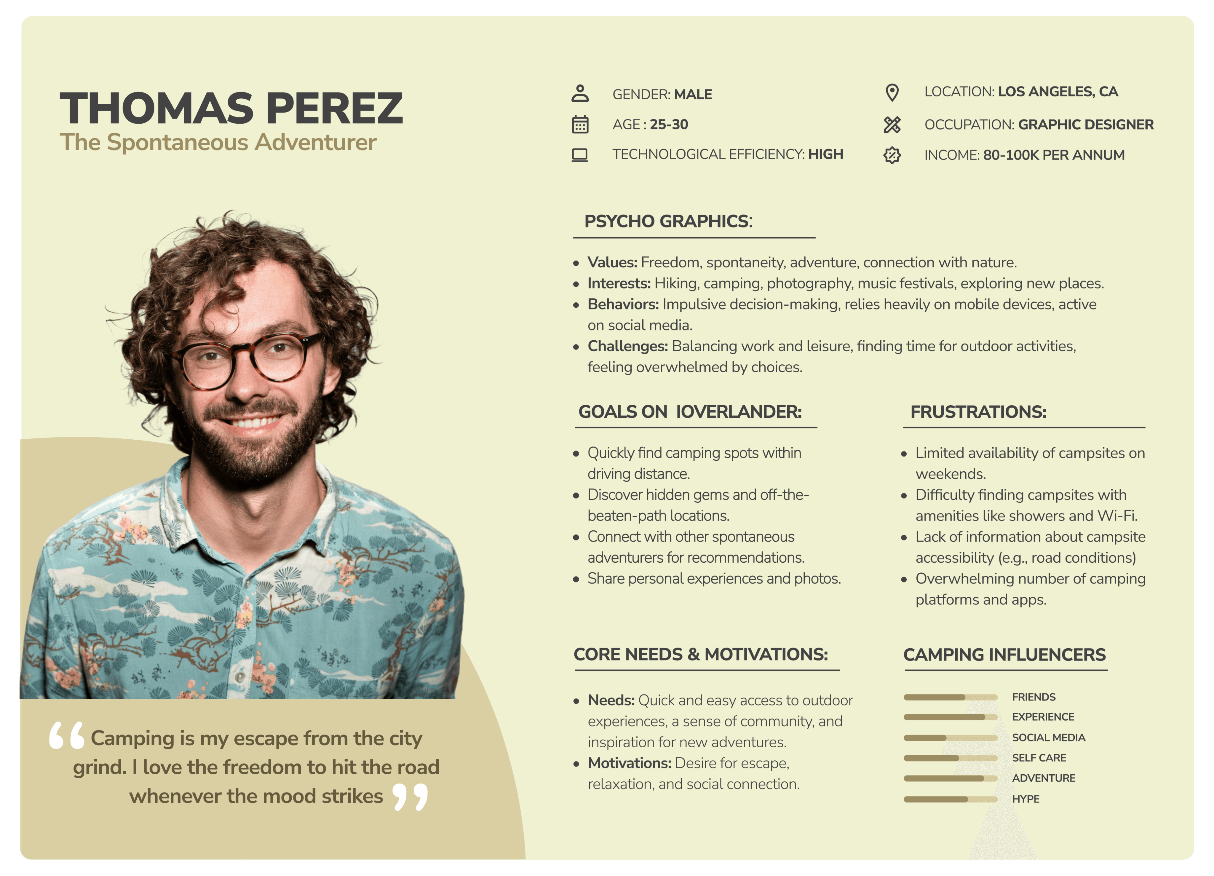
Thomas's Needs and Pain Points:
Quick and Easy Access: Thomas needs a platform that allows him to quickly find camping spots within driving distance.
Hidden Gems: He's always on the lookout for off-the-beaten-path locations and unique experiences.
Community Connection: Thomas values the opportunity to connect with other like-minded adventurers and share experiences.
Mobile-Friendly Experience: He relies heavily on his smartphone for planning and booking trips.
Clear and Concise Information: Thomas needs accurate and up-to-date information about campsites, including amenities, accessibility, and user reviews.
Seamless Booking Process: A simplified booking process with flexible options for spontaneous trips.
Customer Journey
background
Thomas's Journey: A Spontaneous Getaway
Lost in the Crowd: The Networking Dilemma
Thomas, a young, tech-savvy designer, seeks a quick weekend escape. He turns to iOverlander to find nearby campsites. However, he faces challenges with a cluttered interface, outdated information, and a complex booking process.
Smaller, intimate events like industry meetups or workshops can still present challenges for attendees looking to build meaningful connections. Traditional networking methods, while effective in smaller settings, may not always facilitate efficient and personalized interactions.
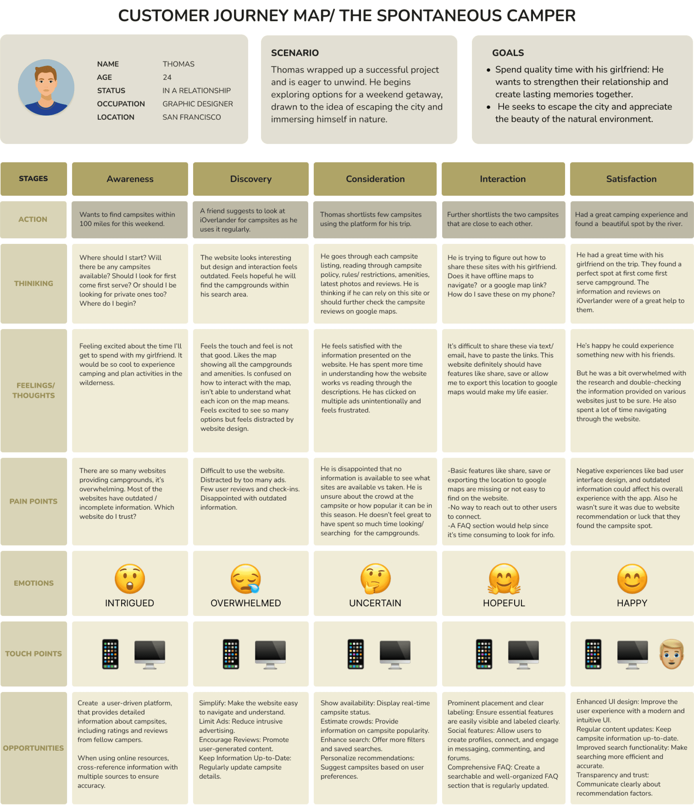
Key Opportunities to Enhance iOverlander:
Intuitive Interface: Simplify the website’s design for easy navigation.
Real-time Information: Provide accurate and up-to-date campsite availability.
Seamless Booking: Streamline the booking process and offer flexible options.
Community Engagement: Foster a sense of community through user reviews and forums.
Mobile Optimization: Ensure a seamless experience on mobile devices.
Redefining the Problem
How might we create a platform that offers a curated selection of campsites for spontaneous getaways, complete with booking options and local recommendations?
Redefining the Problem
How might we create a platform that offers a curated selection of campsites for spontaneous getaways, complete with booking options and local recommendations?
Redefining the Problem
How might we create a platform that offers a curated selection of campsites for spontaneous getaways, complete with booking options and local recommendations?
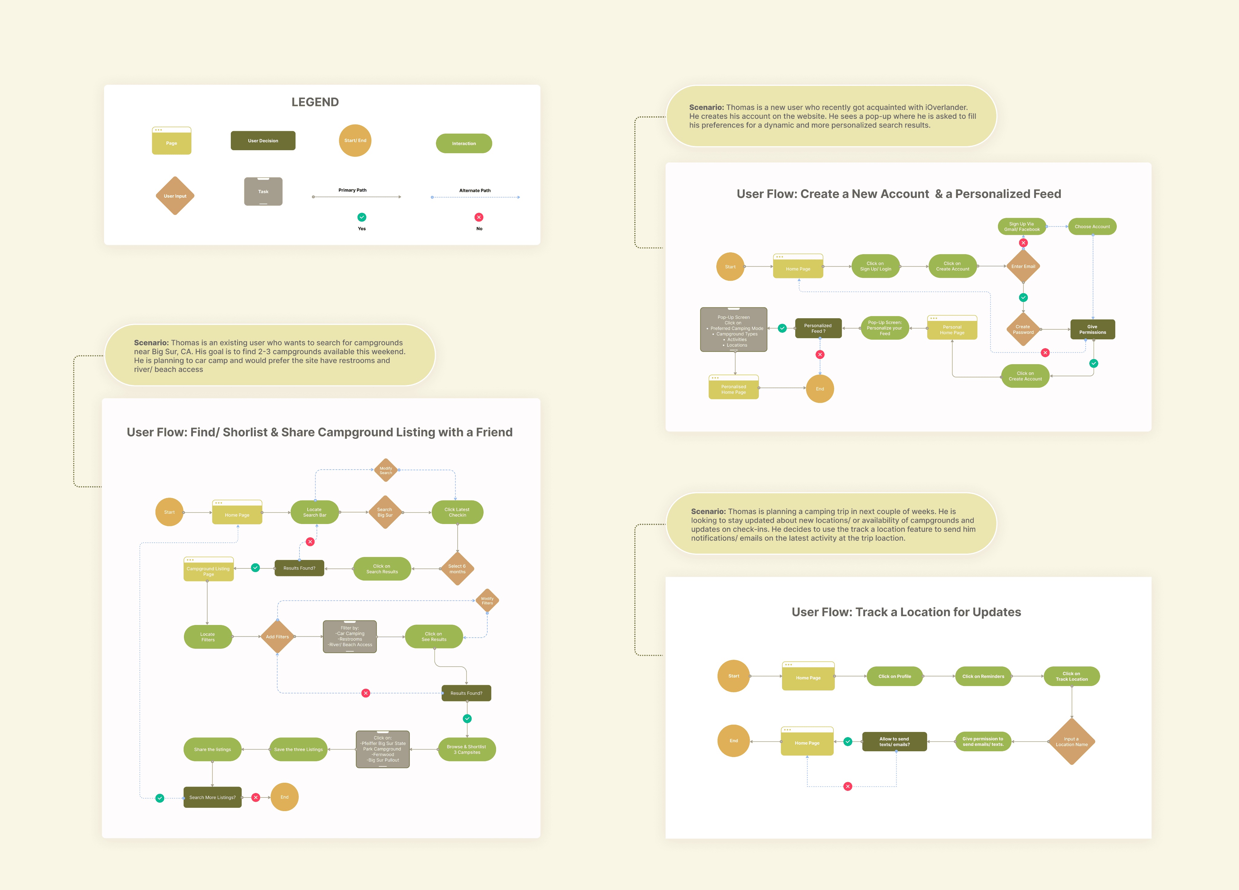
Thomas’s journey of finding campsite
background
Creating User Flow
Lost in the Crowd: The Networking Dilemma
To design a user-friendly platform, we mapped out key user flows. We focused on the "Find/Shortlist & Share Campground Listing with a Friend" flow, as it highlights the social aspect of camping.
Smaller, intimate events like industry meetups or workshops can still present challenges for attendees looking to build meaningful connections. Traditional networking methods, while effective in smaller settings, may not always facilitate efficient and personalized interactions.
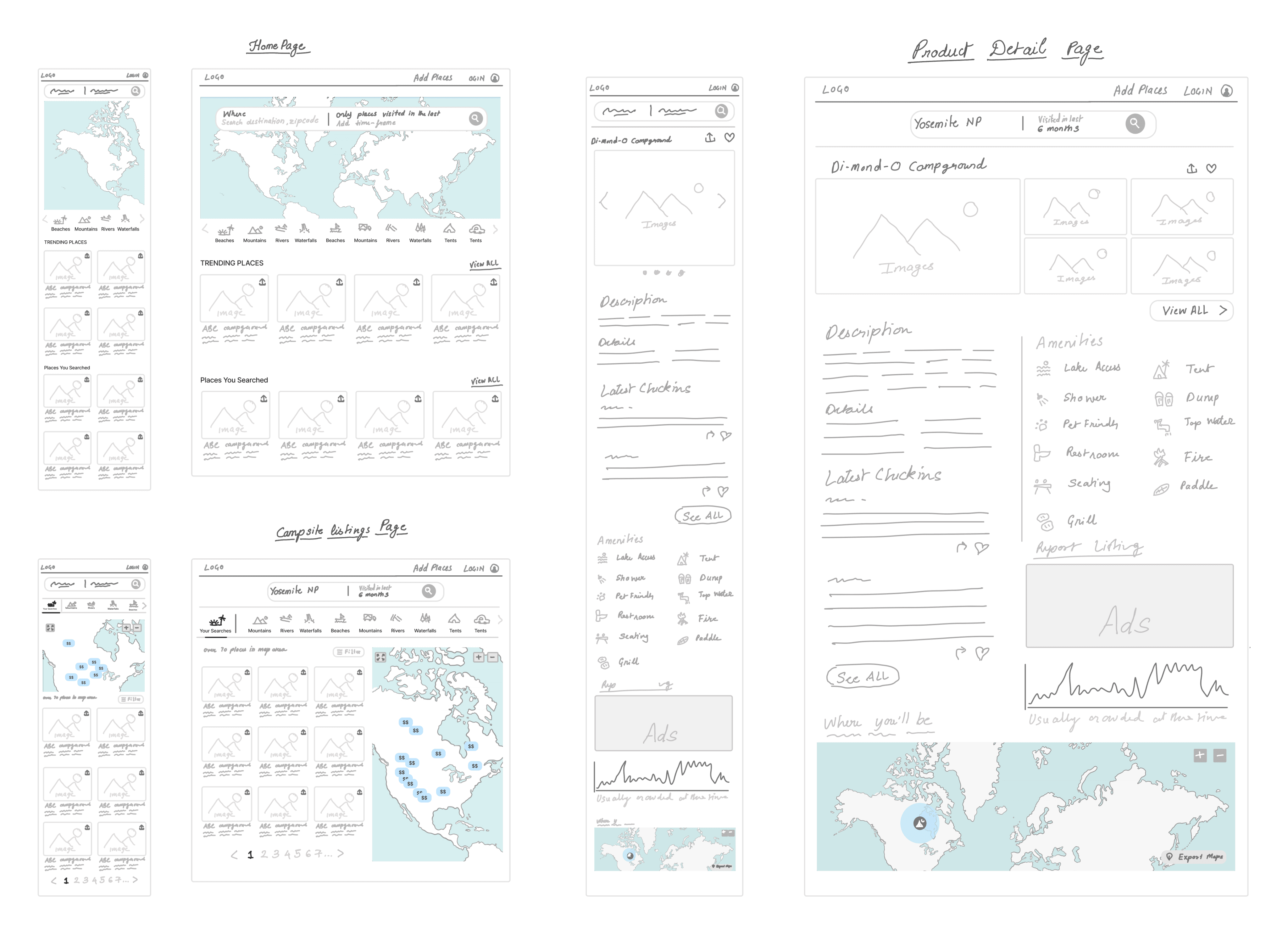
Laying the Foundation
Low-Fidelity Sketches
These low-fidelity wireframes address the challenges faced by spontaneous travelers like Thomas by providing a clean, intuitive interface. Key features include:
Simplified Search: A clear search bar and filter options allow users to quickly find available campsites based on their preferences.
Visual Clarity: The map-based interface provides a visual overview of campsites, making it easy to identify nearby options.
Focused Information: The product detail page prioritizes essential information, such as availability, amenities, and user reviews.
Mobile-Friendly Design: The responsive layout ensures a seamless experience across different devices.
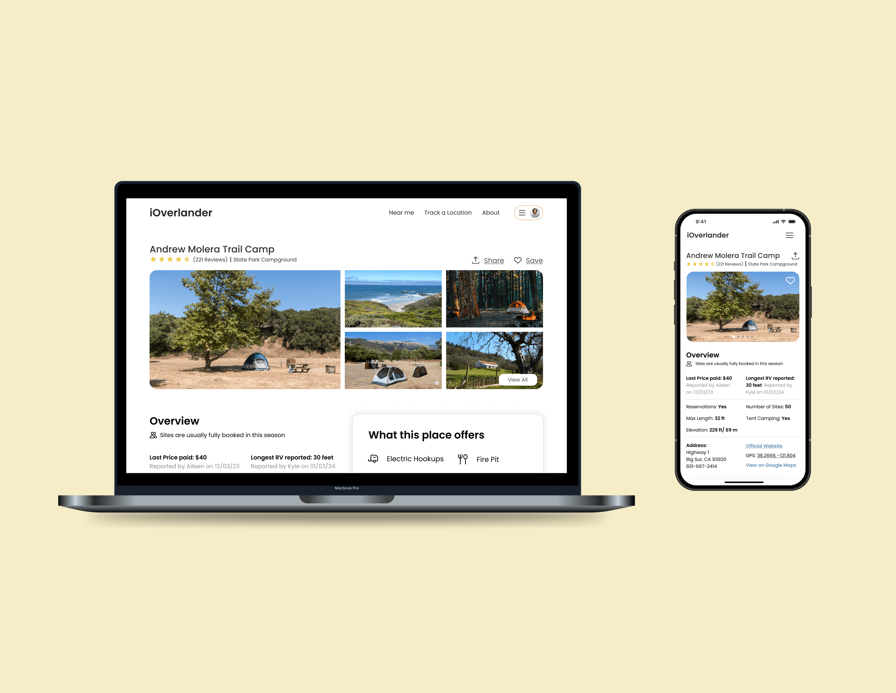
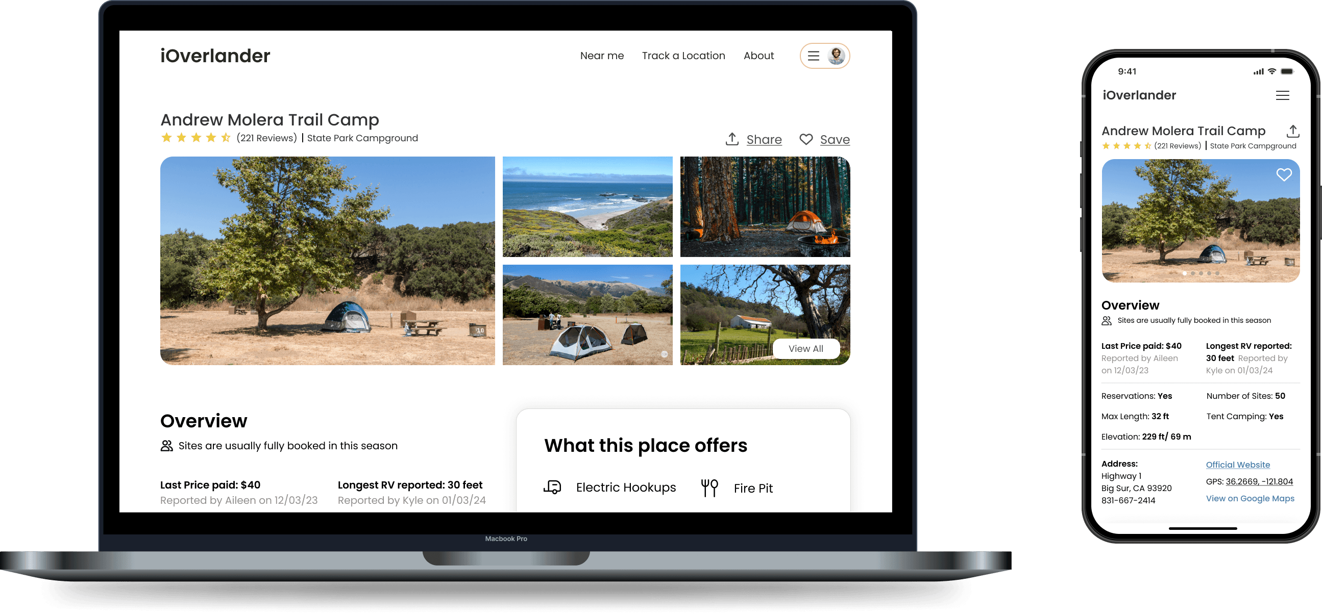
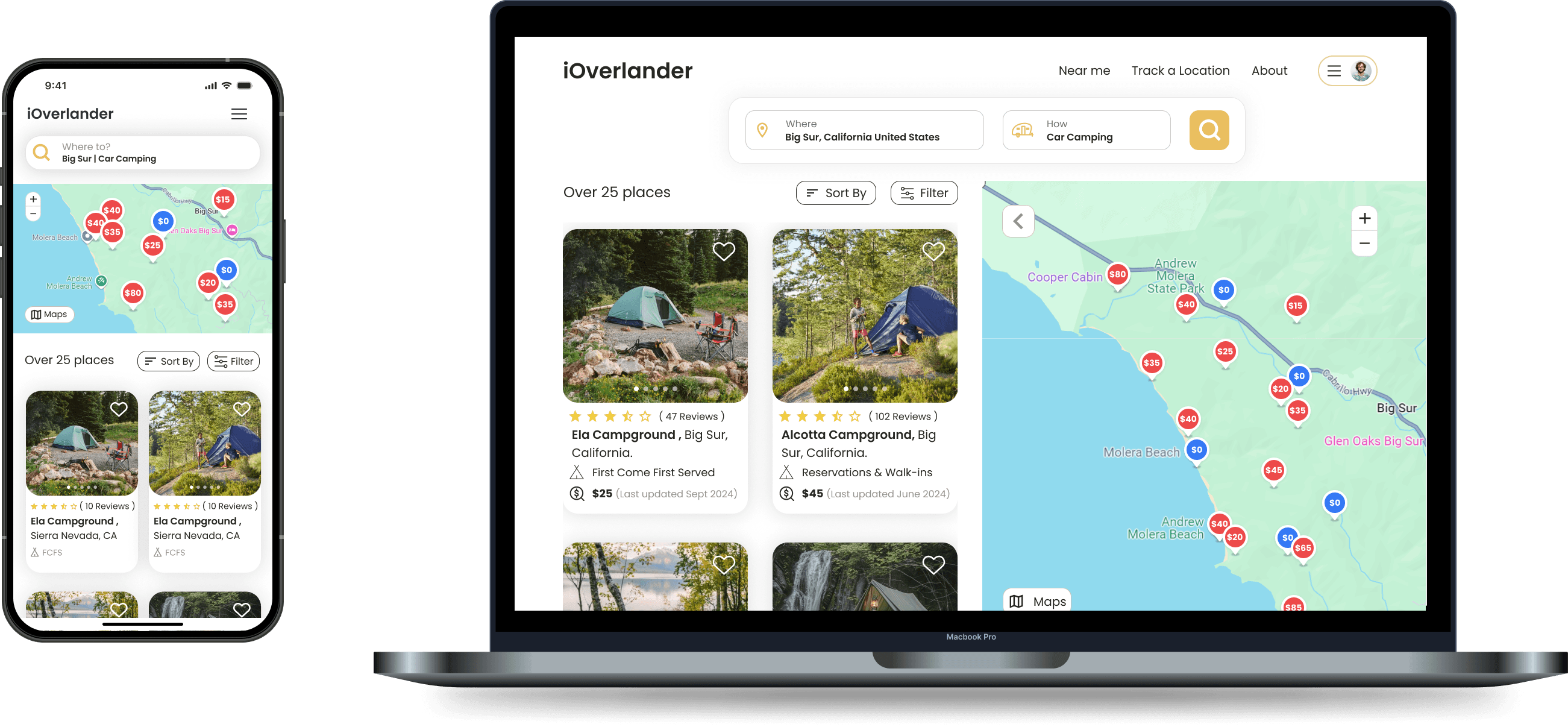
Pencil to pixels
High- Fidelity Wireframes
These hi-fidelity wireframes bring the "Find/Shortlist & Share Campground Listing with a Friend" flow to life, addressing the needs of spontaneous travelers like Thomas. The design emphasizes:
Clear Search & Filters: Easy to find last-minute campsites.
Visual Emphasis: Key information at a glance.
Mobile-First Design: Seamless experience on all devices.
Social Sharing: Recommend campsites to friends.
1.Home Page
1.Home Page

2.Product Detail Page
2.Product Detail Page
3.Product Listing Page
3.Product Listing Page
A Real-World Reality Check
Usability Testing
We conducted a usability test with 5 experienced campers to evaluate the redesigned iOverlander website. Participants were tasked with various scenarios, including searching for last-minute campsites and exploring detailed campground information.
Key Findings:
Homepage:
The "Last Minute Plans" section was often overlooked.
The "Trending in California" section could be more prominent.
Search & Filter:
The search icon was sometimes confusing.
Color contrast issues hindered readability.
Accessibility features in filters were lacking.
Product Listing Page:
A larger search bar would improve visibility.
Filter and sort options were missing for last-minute plans.
Product Detail Page:
The "Add Photos" feature was misplaced.
The "Search Reviews" feature was deemed unnecessary.
sneak peek into the final product
background
Final Prototype
Lost in the Crowd: The Networking Dilemma
To showcase the redesigned IOverlander platform, a high-fidelity prototype was created. The videos demonstrate the process of searching for campsites, filtering results, and exploring detailed campsite information.
Through this prototype, some valuable insights were gained into the importance of clear navigation, intuitive search functionality, and visually appealing information presentation.
Smaller, intimate events like industry meetups or workshops can still present challenges for attendees looking to build meaningful connections. Traditional networking methods, while effective in smaller settings, may not always facilitate efficient and personalized interactions.
closing notes
Conclusion
The redesigned IOverlander platform prioritizes user experience, addressing the pain points of overlanders. With a focus on intuitive design and seamless functionality, users can easily discover and book campsites.
While the project successfully achieved its goals, future iterations could explore further opportunities for improvement. For instance, incorporating advanced AI-powered recommendations could enhance the personalization of the user experience. Additionally, expanding the platform's social features, such as real-time chat and community forums, could foster a stronger sense of community among overlanders.